
Speaking of movies, are there any Netflix users out there who'd like to be one of our special Netflix Friends? You may not reach the current 81% level of compatibility that we have with our friends David & Chelsea, but it's still interesting to see what people we know have been watching and enjoying.
Long-time friend and local historian (and, until recently, Orange County Archivist) Phil Brigandi has a new blog called Notes From a Lost Valley, about the history of Lost Valley, home to the Boy Scout camp where we both worked. His most recent entry mentions me at the end — I'm a part of history!
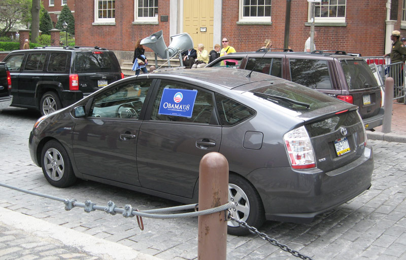
Yes, it's a Prius with Obama signs taped to the sides and two loudspeakers on top, blasting the music from the "Yes, We Can" video loud enough to be almost completely distorted and unintelligible. Way to play to a stereotype, dude. This is why I don't have any bumper stickers on my own Prius; between our living in Orange County, the car, and the Berkeley license plate frame, anyone who wasn't already on my side would just say "eh".
I'm a type geek — and not just the kind of guy who has a lot of fonts installed on his computer. I once took a typeface design class from Sumner Stone; one year for an anniversary present, Shelby and I learned how to set metal type at the San Francisco Center for the Book. Shelby and I made a deal; when we shell out to get her the "Definitive Gold Box Edition" Twin Peaks box set, I get a copy of TypeTool. For a while, I considered guiding my career towards the technical side of electronic type (and later wound up gladthat I didn't, for the code that puts letters on your screen or inside your printer can at times be astonishingly tedious).
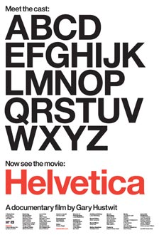
So, it was with great anticipation that I waited for Helvetica, a documentary by Gary Hustwit, to arrive from Netflix. And it was everything I expected it to be! Helvetica uses the story of the typeface Helvetica — from its origins to its ubiquitous status, fifty years later, in today's world — as a starting point for a wider exploration into various schools of typographic thought and the usually-invisible-but-pervasive role of type in our everyday lives. Hustwit interviews an entertaining collection of type luminaries whose eloquence and enthusiasm for their field provides an accessible display for 'normal' people as to why the type-obsessed get so wrapped up in this stuff. Highly recommended!
(Hustwit came to screen Helvetica at Adobe's "Technology Summit" back in February; afterwards, all us type nerds got to line up like giddy schoolgirls [or something] and purchase DVDs of the movie from the man himself.)
One pair who was interviewed in Helvetica, Jonathan Hoefler and Tobias Frere-Jones of the Hoefler & Frere-Jones Type Foundry, have achieved an unusual amount of fame (for type designers) this year, thanks to the fact that the Obama campaign is using one of their fonts, Gotham, as a main component of its graphic identity. Newsweek has my favorite article on the Obama 'brand' (an interview with Michael Bierut, who also appears in Helvetica), which notes how Hillary's website has come to look more and more like Obama's over time. Gotham has also been mentioned in the New York Times, the Los Angeles Times, and the Boston Globe.
H&FJ have their own blog; they decline to say much about Obama's use of their own font, but they make up for that with their comments about Hillary and McCain's typographical choices:
Hillary's snooze of a serif might have come off a heart-healthy cereal box, or a mildly embarrassing over-the-counter ointment [ ... ] But Senator McCain's typeface is positively mystifying: after three decades signifying a very down-market notion of luxe, this particular sans serif has settled into being the font of choice for the hygiene aisle.
(Be sure to click through to see Hillary and McCain logos repurposed into serving more appropriate products.) Also good is their compare-and-contrast between newly-announced British coinage and our new $5 bill:
Above, the new face of British currency, announced by the Royal Mint. The striking new designs, selected from an open competition that attracted four thousand entries, are the work of a 26-year old graphic designer named Matthew Dent. They are Mr. Dent's first foray into currency design.
Below, the new five dollar bill, introduced last month by the United States Department of the Treasury. The new design, which features a big purple Helvetica five, is the work of a 147-year-old government agency called the United States Bureau of Engraving and Printing. It employs 2,500 people, and has an annual budget of $525,000,000.